IBC Brand Identity redesign
Redesign of the brand identity of IBC, a company dedicated to the education and training of professionals in the field of medicine specifically surgery.
Concept
There are two essential elements to any field of training: theoretical knowledge and practical experience.
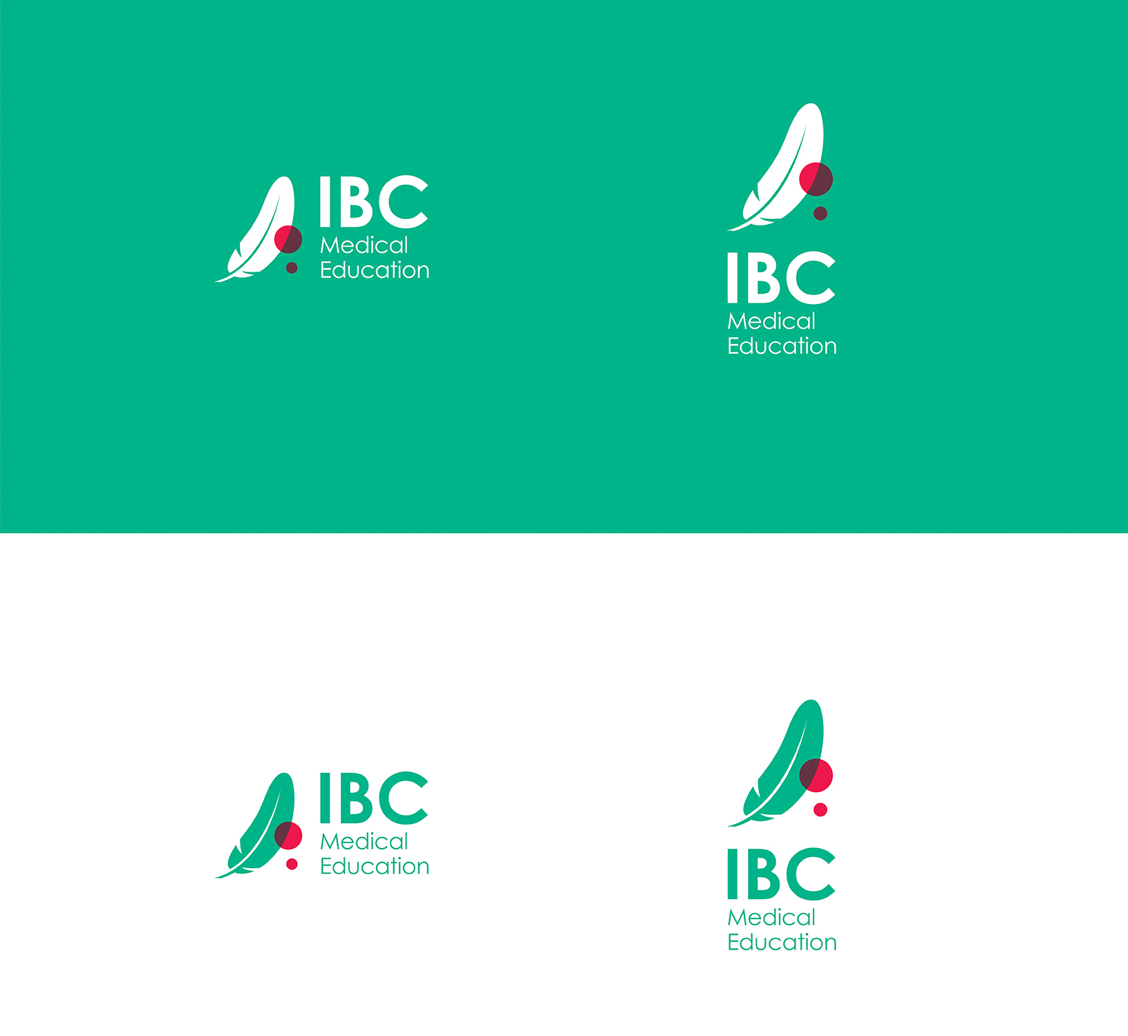
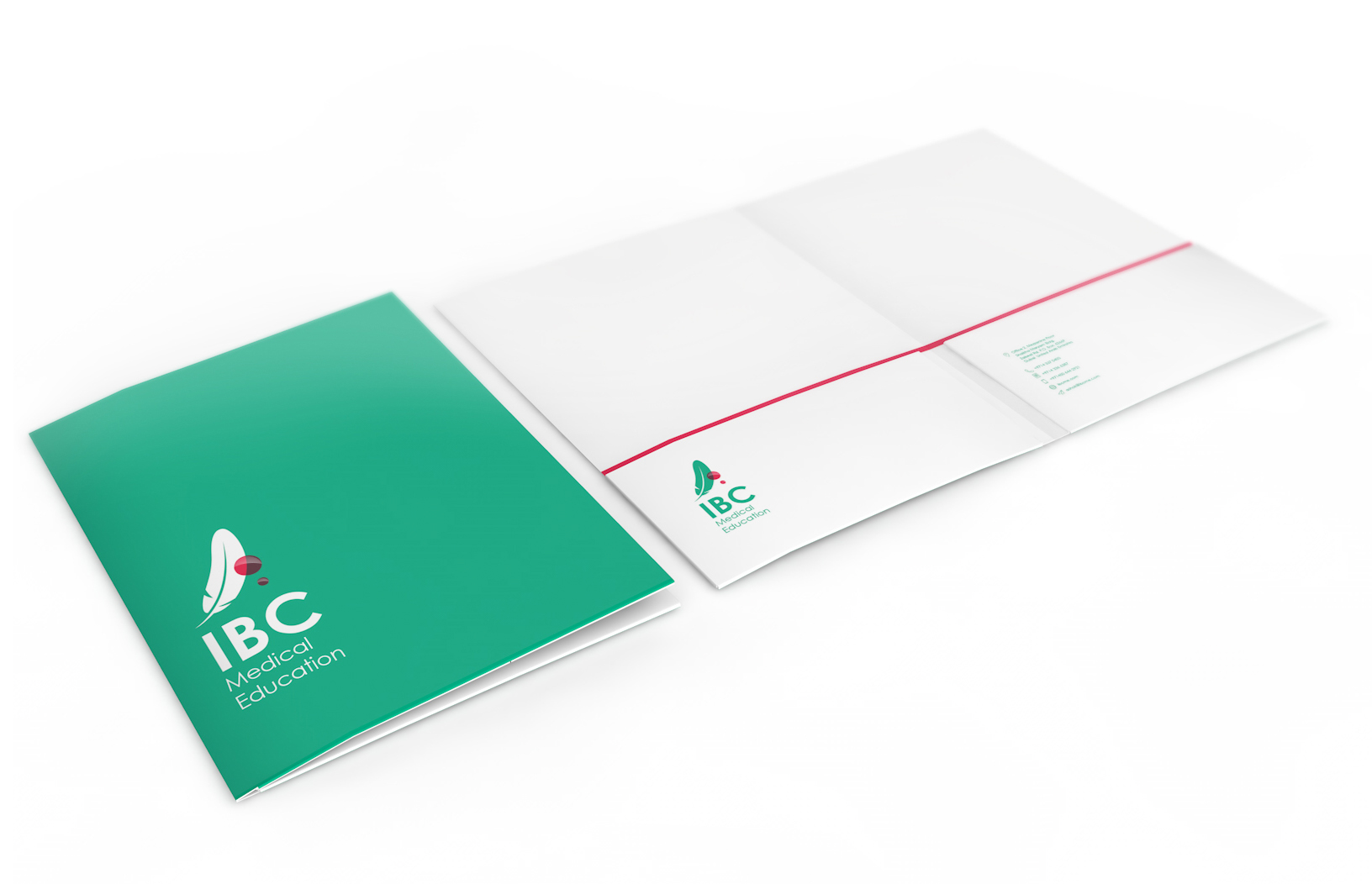
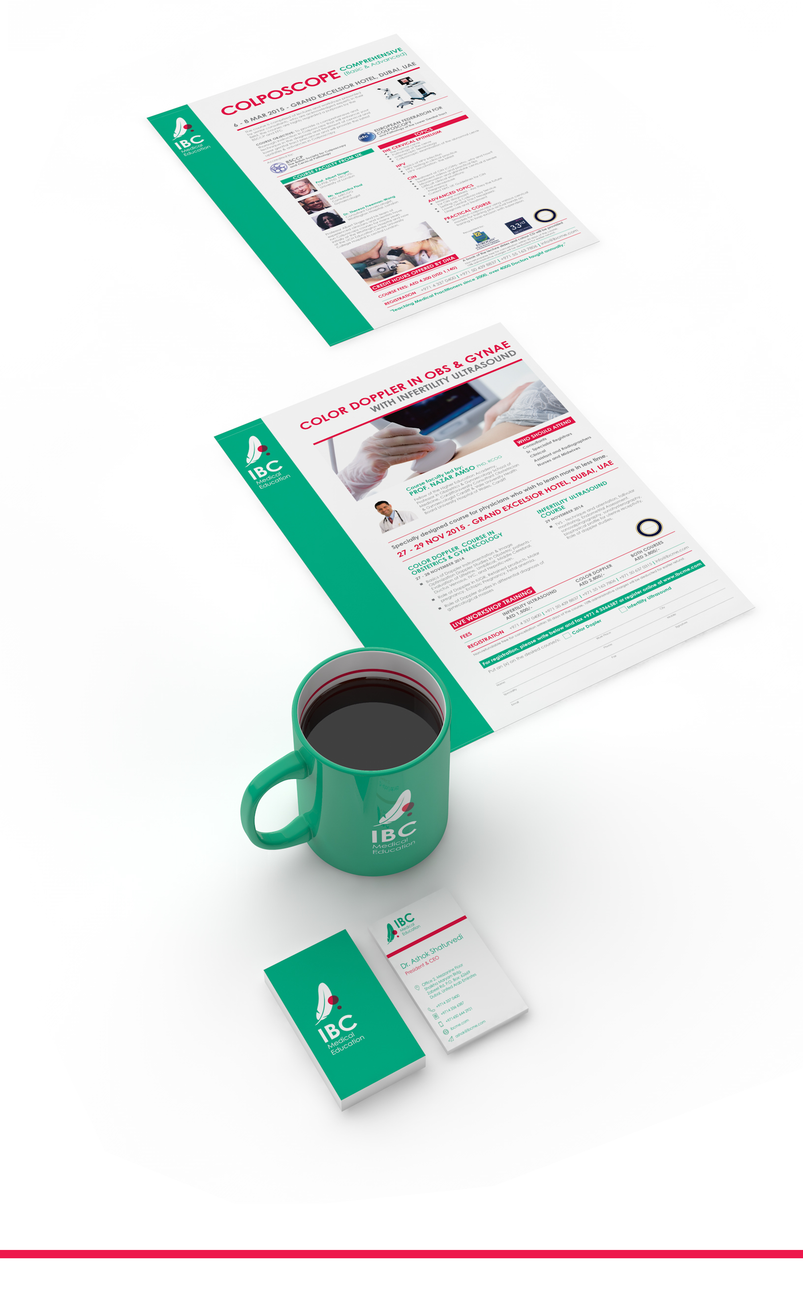
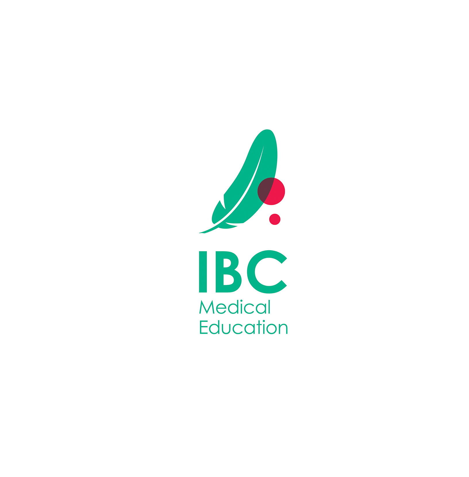
In this identity route, we show a merger of the two aspects. The ‘theory’ part represented by the feather, which has always stood as a symbol for learning in history. While the ‘practical’ aspect is shown through delicate drops of blood - something that every surgeon or medical practitioner is used to.
Symbolically, a green feather has many positive associations, including success and money, fertile opportunity, healthy vitality and new beginnings.
‘When angels are near, feathers appear’